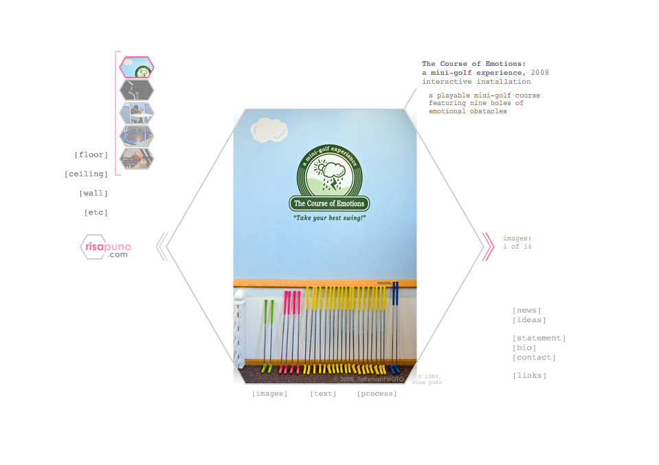
It is super-embarrassing to admit that, until today, I hadn't updated my site in 4 years. Yes, shameful. I know. And since it had been so long, the process of editing photos and remembering how to change everything seemed so intimidating. But eventually I had to face the fact that the legacy of the late, great Steve Jobs left those of us with Flash-based sites S.O.L. Plus, in addition to lack of compatibility with Apple mobile products, my images were entirely too small and the whole site opened up with with a ridiculously loud, clunky animation. And, of course, the whole thing was a GIANT pain to update. So I was pretty much stuck doing a complete redesign. But despite all its faults, I was kind of sad to let go of my old design. It was quirky, girly, and nerdy... just like me. I loved the hexagonal mask on my photos (though it was a total b*tch to crop for!), and I absolutely adored my little wind-up key loading icon. So let this be my last tribute to the old gal:
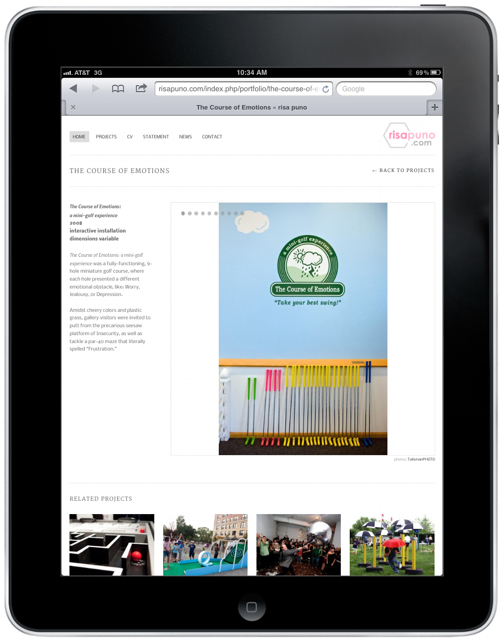
Ok, moving on... this new version is MUCH easier to edit, and I'm looking forward to keeping people up-to-date with my latest work. (After all, what's the use in having a beautiful site that no one can see, with bunch of images that are out-of-date?) So here's the same piece, The Course of Emotions: a mini golf experience, in the new format (using a screenshot from my iPad!):
It may not be as unique as the previous version, but it is certainly much more user friendly. Plus, there are tons of new images... over half the projects on this version never made it to the old site because it was so difficult to update. AND in this version, the images are large enough to see! (But let's be honest, Talisman Brolin takes such amazing photos of my work that I could probably tape them to some dog poo, call it a website, and still have people "ooh" and "ahh" over it.) Seriously though, I've been champing at the bit to unveil my new labor of love. These are the other features that I am most excited about:
- home page with big photos of featured projects
- ability to tag projects with multiple categories for filtering
- the "Related Projects" section at the bottom of the single project pages
- links to articles in my CV bibliography
- my Twitter updates on the News pages
- mailing list sign-up
- better search engine optimization
- super easy back-end interface for content management
It's taken me a few crazed months to get here, and I have learned a TON in the process. I went into this with no idea what I was doing. However, thankfully, my friend Anshey Bhatia of VPV Interactive gave me some great advice and a much needed nudge. He tipped me off about how I could use WordPress on the back-end as a content management system—even for a portfolio-centric site. And he introduced me to themeforest.net, an incredible resource for site templates and themes. From there, I spent days combing through (literally) hundreds of themes, until I found one that most closely matched my needs:
 The template only cost me $35 (+$2 transaction fee), and the developer who made the theme seems like a really nice guy and was pretty darn patient while answering my many bullet-listed questions. You can see the original theme in action here.
Mine may not seem so different from the original, but it took me what felt like a bajillion little tweaks to get it where I was proud to call it my own.
In fact, I cannot tell you how many times I 'broke' the site while figuring things out. The first time I saw the WordPress blank screen of death was when I learned that the best way to edit an existing theme is to create a child theme. In a very un-Risa fashion, I didn't read through all of the directions and instead just followed them step-by-step. When I got locked out of the site and was staring at the stupid blank white screen, I completely panicked, deleted the entire WordPress install, and had to start all over again. Needless to say, it sucked. However, thanks to this article on site recovery tips and tricks, I now know the magic of the wp-config.php file.
And while I'm giving resource links, here is my favorite reference site for HTML tags and CSS properties... as well as a great "hold-your-hand-like-a-small-child" PHP guide for coding dummies like me. Thanks to these websites (and countless others), I was able to stop the random trial-and-error approach to tweaking the theme, and actually gained a basic understanding of the proper syntax and codex. (In fact, I was even able to write some of my very own PHP functions!) I am so grateful that people post information on the Interwebs for lost souls like mine. I would never be able to make anything at all without Google.
And speaking of gratitude... thanks again to Anshey for lighting the fire under my ass for this project, and thanks to Tally for all the incredible photos. And of course, thank you to my dear friends and fam for being such great beta testers. :)
I hope you enjoy this website and are able to find all the information you need (and maybe even a little more). If you have any problems or issues using the site, please don't hesitate to send me a message.


